Saturday, May 20, 2006

Carnivale

This is a gift for my friend Tawn Tawn (happy birthday, Tawn!) who turns 25 next week. She introduced me to a bizarre and wonderous show called Carnivale last year. Amy and I bought her the first season on DVD, and this drawing is intended to be a "It ain't here yet" note.


I found a picture online of Brother Justin standing behind Ben in a diner, and decided ot sketch it with a brush and ink. No pencils before-hand, just ink straight to bristol. Hence, there are a few drawing problems. I messed up a bit on Ben's face, so it doesn't really look like Nick Stahl. Brother Justin looks ok, though. You get "Clancy Brown" from it.

Friday, May 12, 2006

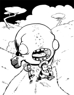
First Look: Pook Chase

Here's a li'l piece I drew up last night depicting a possible scene from the comic I'm working on. I'm still working out the title and all that, but the two characters you see running are named George and Ben.

I was working on a gray-toned version but Photoshop crapped out on me and erased all my work. Gall-dangit.

Oh yeah, one more note: this is an homage to piece by Doug TenNapel that can be found in his convention sketchbook from last year which featured, guess what, two dudes getting chased by a giant thing.

Wednesday, May 03, 2006

Comic stuff continued

Steve Purcell is an artist I'm rediscovering.

Way back in junior high, I loved the Sam & Max game, so I went out and bought the only Sam & Max TPB at a no-longer-there bookstore in the Carlsbad mall. (Turns out it's out-of-print now and extremely valuable!) I was first drawn to the humor and the cartoonish violence, but now I realize Purcell is also an all-around tremendous artist. His pencils and layouts are stuffed with detail, his inks are some of the slickest I've ever seen, and he can paint too. (In fact, I got two signed prints of Sam & Max that I'm going to shop for frames for today.) I hear he's working for Pixar now, which is appropriate. I wish he'd do more comic stuff; he is doing a little comic for the upcoming Sam & Max game, but it's not very long.

Bill Watterson: I have his Sunday Pages book which features photo-duplications of a number of his Sunday strips. This is particularly fascinating because you can see exactly how he works. You can see the ink strokes, the white-out, even a bit of the pencils. Not a whole lot more to say. He's good.

Stan Sakai of Usagi Yojimbo: his is a style I'm inclined to attempt.

It looks like he forgoes a brush altogether in favor of a technical pen. Consistent line weights throughout. His story-telling is so clear, though. And he draws wonderful backgrounds, another element I need to study further. I suck at backgrounds that aren't grassy fields.

**

I'm using (almost exclusively) a Winsor Newton Series 7 #3 brush for my current comic. I'm using a Micron pen (#5) for gun details to give them a more mechanical look, but the brush works for everything else. I bought some Zip-a-Tone at Art Supply Warehouse that I'm very eager to finally try out, but I'm not sure if I should on the comic or not. It's actually easier just to add tones in via computer, and then it's very easy to take them off again, so I probably won't end up using the Zip. Perhaps an opportunity will arise on some splash pages or "pin-ups," if you will.

Tuesday, May 02, 2006

Comic stuff

My current dedication to doing a comic has led me to study my own collection in greater depth than I ever have before. As I went to ink the first page, I went through Earthboy Jacobus, Usagi Yojimbo, Gear, Sam & Max, Calvin & Hobbes, Solomon Fix, and Bone and began to realize things about the art I'd never seen before.

First off, Jeff Smith of Bone is an incredible artist. I know, I know, everyone knows that. I already knew that. But before it was just the sort of thing you say, the sort of thing that everyone says. I even knew why to some degree, but studying his line-work now and his compositions and use of strict black and white, my gosh. He was the man from the get-go, too, unlike others where a clear artistic progression has taken place and you can say, "Yeah, he's definitely improved since issue 1." Jeff Smith started out strong and stayed there.

A surprising revelation was found in Gear, which was my favorite TenNapel work artistically for years.
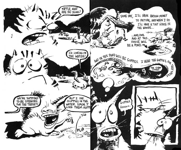
He used a big Japanese brush (according to the notes in the back) and he used a dry-brush technique quite often. He says he worked very quickly to keep the art fresh and alive, and I can see that a lot more clearly now. Some of the panels are actually rather confusing due to line-weights being equal throughout. Some of the drawings seem like they could benefit from quick re-do as well (they're a bit looser than the rest of the book). I still love most of the art (the contrast-defined images and the character designs, for example), but it doesn't seem as strong to me as it once did. Solomon Fix has taken over for my favorite artistic work of his.
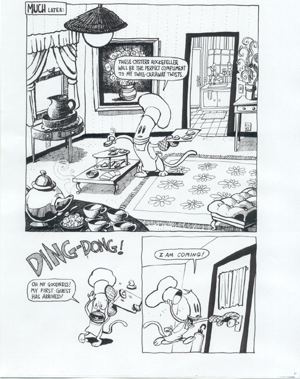
Make no mistake, Creature Tech and Earthboy Jacobus feature some very strong art as well, but I'm still drawn more to his non-human work.

More on comic art to come...